

Layouts Overview
The layout decides how your product photos are arranged on the page: one big image with thumbnails, a grid that shows everything at once, or a scrolling column. Pick the one that suits your photos and your shoppers.
A layout is the overall arrangement of the gallery. Smart Product Gallery has eleven, and you choose one in FluentCart → Product Gallery → General → Gallery Layout. Settings are global, so the layout you pick applies to every product in your store.
 Thumbs Bottom In the free pluginMain image with a thumbnail strip underneath. The default.
 Thumbs Left A vertical thumbnail column on the left of the main image.
 Tiles Every image at once, in an even grid of columns.
 Hierarchy Grid A full-width lead image with a grid of the rest below.
 Modern Grid Five editorial mosaic patterns with mixed tile sizes.
 Anchor Nav Images stacked in a column, with dots that jump to each one.
 Vertical Scroll A scrolling column of images beside a sticky thumbnail rail.
 Thumbs Right A vertical thumbnail column on the right of the main image.
 Thumbs Top In the free pluginThe thumbnail strip sits above the main image.
 Multi-row Thumbs Thumbnails wrap onto several rows instead of scrolling.
 Slider Just the main image and its arrows or dots — no thumbnails.
The free plugin has two layouts
The free plugin includes Thumbs Bottom and Thumbs Top. The other nine layouts come with Smart Product Gallery Pro. See Requirements for the full free/Pro pairing.
Compare them at a glance
| Layout | Thumbnails | Slides one image at a time | Best for | Free plugin |
|---|---|---|---|---|
| Thumbs Bottom | Strip below | Yes | Most stores — the familiar default | Yes |
| Thumbs Top | Strip above | Yes | Putting the alternate views first | Yes |
| Thumbs Left | Column on the left | Yes | Wide pages, tall product shots | No |
| Thumbs Right | Column on the right | Yes | The same, mirrored | No |
| Multi-row Thumbs | Rows below that wrap | Yes | Products with many photos | No |
| Slider | None | Yes | Few photos, clean look | No |
| Tiles | None | No — all images in a grid | Showing every angle at once | No |
| Hierarchy Grid | None | No — lead image + grid | One hero shot plus details | No |
| Modern Grid | None | No — mixed-size mosaic | Editorial, lookbook-style pages | No |
| Anchor Nav | Dots that jump to each image | No — stacked column | Long scrolling product pages | No |
| Vertical Scroll | Thumbnail rail that jumps to each image | No — stacked column | Fashion and apparel | No |
How to choose
Start with the question your shopper is asking.
- "Show me the product, then let me look closer." Pick a thumbnail layout — Thumbs Bottom is the safe choice and the default. Thumbnails tell shoppers at a glance how many photos there are.
- "Show me everything." Pick a grid — Tiles, Hierarchy Grid or Modern Grid. Nothing hides behind a click, which suits products where every angle matters (shoes, furniture, jewellery).
- "Let me scroll through it like a magazine." Pick Vertical Scroll or Anchor Nav. Images stack in a column while the product details stay beside them.
- "Keep it minimal." Pick Slider — one image with arrows and dots.
A few practical rules of thumb:
- How many photos do your products have? With two or three, a grid can look sparse and a thumbnail strip half empty — the Slider or Hierarchy Grid usually looks better. With ten or more, Multi-row Thumbs or a grid with a Show More button keeps the page tidy.
- Are your photos the same shape? Grids look best when images share an aspect ratio. Mixed portrait and landscape shots sit more comfortably in a slider.
- Where do your shoppers browse? On phones, every layout collapses to fit a narrow screen; grids drop to fewer columns, and the mosaics flatten into a simple grid. Check your product page on a phone after switching.
How to switch layouts
- In your WordPress dashboard, go to FluentCart → Product Gallery.
- On the General tab, click a card under Gallery Layout.
- Click Save Settings. Nothing changes on your store until you save.
- Open any product page to see the result.
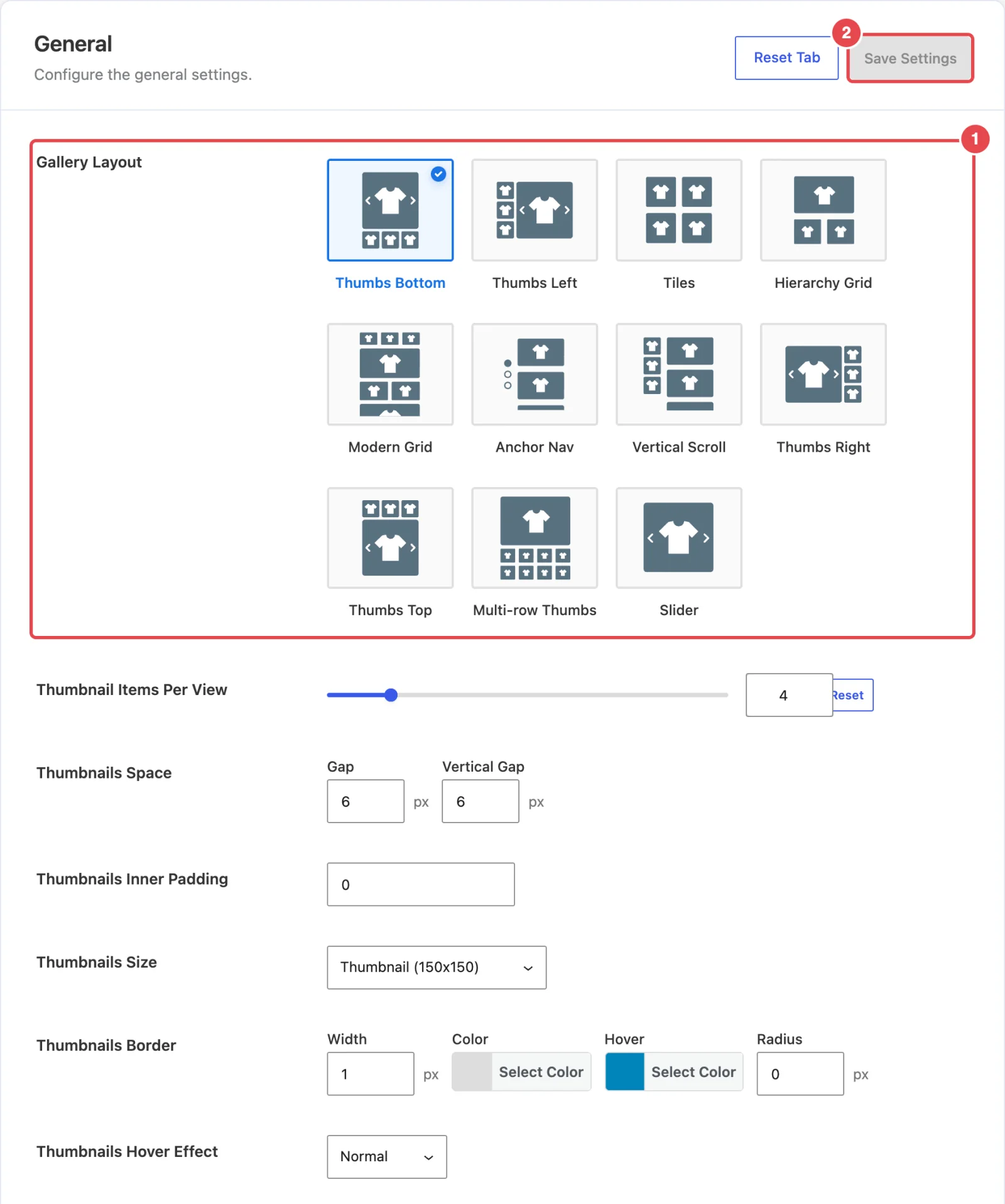
The settings panel adapts to the layout you pick. Choose a grid and the slider options disappear; choose a thumbnail layout and the thumbnail options appear. Each layout page below lists exactly which settings apply.
Settings are kept when you switch
Switching layouts doesn't throw away your other settings. If you style the thumbnails, switch to Tiles and later switch back, your thumbnail styling is still there.
Where to go next
- General settings — the full field reference for the layout picker and everything below it
- Settings Overview — saving, Reset Tab and deep links
- Grid with Show More — a walkthrough of a grid layout from start to finish