

Grid with Show More
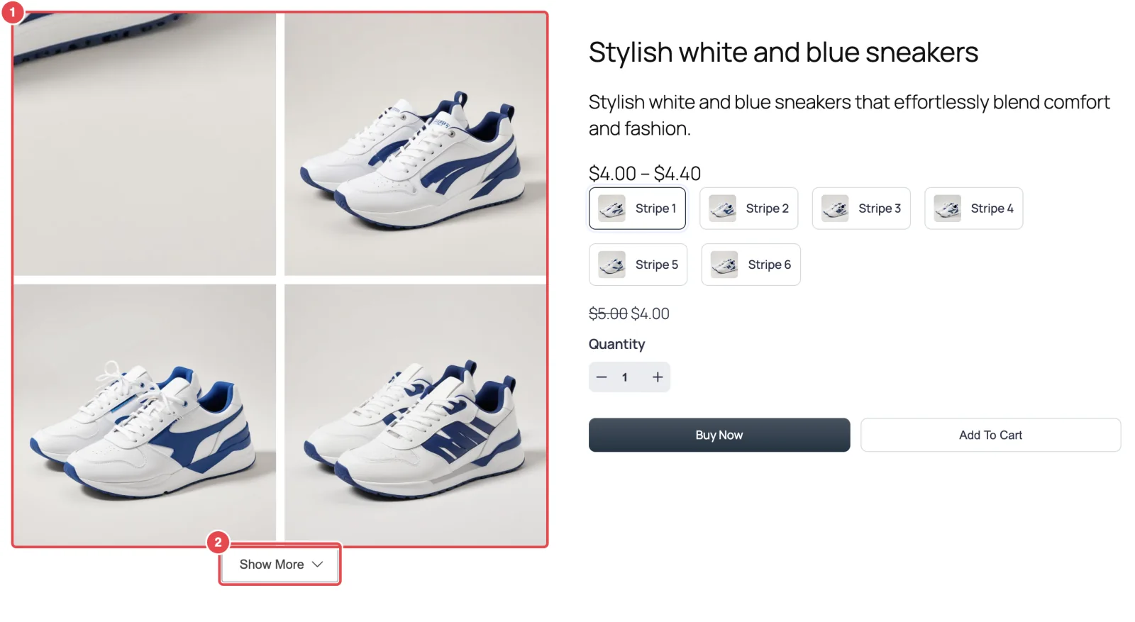
Show every product photo at once in a clean grid, and tuck the extras behind a Show More button so long galleries don't bury the price.
What you're building
Some products are bought on the overall look: a sofa from every angle, a set of mugs, a printed tote bag. For those, a grid that shows everything at a glance often works better than a slider that hides most photos behind arrows.
The catch is length. A product with sixteen photos in a two-column grid is eight rows tall. On a laptop, that pushes the description and reviews a long way down. So you'll show the first four photos and put the rest behind a button.
Before you start
- A product with six or more photos, so there's something behind the button.
- Photos of the same shape. In a grid, mismatched shapes leave ragged rows.
Step 1: Choose Tiles
- Go to FluentCart → Product Gallery → General.
- Under Gallery Layout, click Tiles.
- Set Columns for each screen size. The four boxes are Desktop, Small Desktop, Tablet and Mobile. The defaults (2, 2, 2, 1) suit a gallery that shares the width with product details. Use 3 on desktop only if your gallery column is wide.
- Gallery Image Space is the gap between tiles: Gap across and Vertical Gap down. The default 10px is tidy. Drop it to 4–6px for a tighter, magazine look.
Step 2: Limit how many show
- Still on General, find Visible Gallery Items and choose Specific. Two more settings appear.
- Set Number of Items to 4. With two columns, that's two neat rows. Pick a number that divides evenly by your column count, so the last row isn't half empty.
- Under Gallery Expansion, choose Show More Button. The other choice, Scroll, keeps the extra photos inside a scrolling box. That suits a fixed-height design but is easy for shoppers to miss.
- Click Save Settings.
Refresh the product. You'll see four photos and a Show More button. Click it and the rest appear. The button then changes to Show Less.
Step 3: Style the button
When Visible Gallery Items is set to Specific and the layout is a grid, a new sub-tab appears: Gallery → Show More Button.
- Open Gallery → Show More Button.
- Under Button Label, change the Expand and Collapse text if you like. "See all photos" and "Fewer photos" tell shoppers exactly what the button does.
- Under Color, match your theme. Set the Background to your brand color and the text Color to white, so the button looks like the other buttons on your site. Remember to set Hover Color and Hover Background too.
- Under Border, keep the radius in line with your theme's buttons. If your Buy Now button is rounded, round this one to match.
- Click Save Settings.
Step 4: Decide on zoom and lightbox
Grid tiles are small, so hover zoom has less to work with than on a big main image. Two sensible options:
- Keep the lightbox, turn zoom off. Shoppers click a tile to see it full screen. On the Zoom tab, turn off Enable Image Zoom. This is the cleanest result.
- Keep both. Leave zoom on with the Default style, so a tile magnifies in place on hover.
Click Save Settings after either choice.
Variations on this recipe
- A lead photo. Choose Hierarchy Grid instead of Tiles. The first image spans the full width, with the rest in a grid beneath it. Visible Gallery Items and the Show More button work the same way. Hierarchy Grid →
- An editorial mosaic. Choose Modern Grid and pick one of its five styles. These mix large and small tiles. Modern Grid →
Where to go next
- Layouts Overview — every layout side by side
- Show More Button — every option for the button
- Fashion Store Gallery — the slider-and-zoom approach