

Tiles
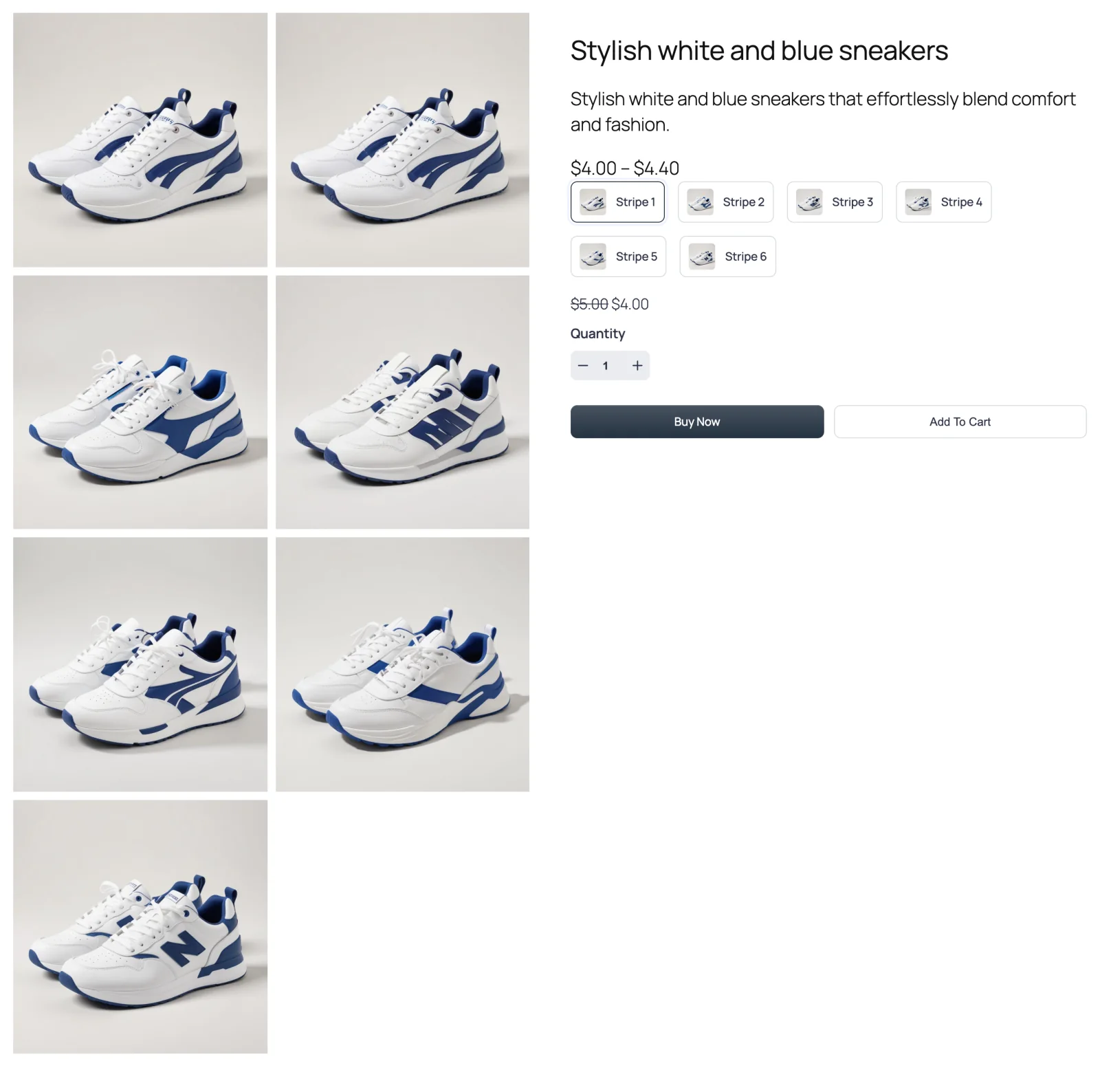
Every product photo at once, in an even grid of columns. Nothing slides and nothing hides behind a thumbnail — shoppers just scroll.

Tiles lays your photos out in equal-sized cells, two columns wide by default. A product with seven photos becomes three full rows and one photo on its own. Because every image is visible, there are no arrows, dots or thumbnails.
The free plugin doesn't include this layout; it ships Thumbs Bottom and Thumbs Top.
When to choose it
- Every angle matters. Shoes, furniture, bags, jewellery — products where shoppers want to compare views side by side.
- Your photos share a shape. A grid looks best when every image has the same aspect ratio, so the rows line up.
- You'd rather not make shoppers click. Plenty of visitors never click a thumbnail. Tiles puts every photo in front of them without asking.
How to switch to it
- Go to FluentCart → Product Gallery → General.
- Under Gallery Layout, click Tiles.
- Click Save Settings.
Settings that appear for this layout
On the General tab:
- Columns — separate numbers for Desktop, Small Desktop, Tablet and Mobile (defaults 2 / 2 / 2 / 1). See Grid options.
- Visible Gallery Items — All, or Specific to show only the first few photos. With Specific you also get Number of Items and Gallery Expansion (a Show More Button or an inner Scroll). See Grid options.
- Gallery Image Space — the horizontal and vertical gaps between tiles (10px each by default). See Grid options.
- Gallery Bottom Gap, Gallery Image Caption and Gallery Image Source. See Gallery image.
On the Gallery tab, Product Image is always available, and Show More Button appears once you set Visible Gallery Items to Specific.
Sub-tabs hidden for this layout
- Gallery Slider, Navigation & Pagination and Thumbnails Navigation — nothing slides in a grid.
Things worth knowing
- Long photo sets make a long gallery. Ten photos in two columns is five rows. If that pushes your description too far down, set Visible Gallery Items to Specific and let shoppers click Show More. The Grid with Show More tutorial walks through it.
- The product details can stay in view. On screens wider than about 770px, the product summary column sticks beside the grid as shoppers scroll, so the Buy button never disappears.
- Zoom and the lightbox still work on every tile. Hover to zoom, click to open the lightbox.