

General Settings
Pick your gallery layout and decide how thumbnails look and behave. Most stores only need this tab to get the gallery they want.
Where to find it: FluentCart → Product Gallery → General (admin.php?page=smart-product-gallery#general)
The General tab changes as you work. Most of its fields belong to particular layouts, so the panel only shows the fields for the layout you've picked. Choose a grid layout and the thumbnail options disappear; choose a thumbnail layout and the grid options disappear. The tables below say when each field appears.
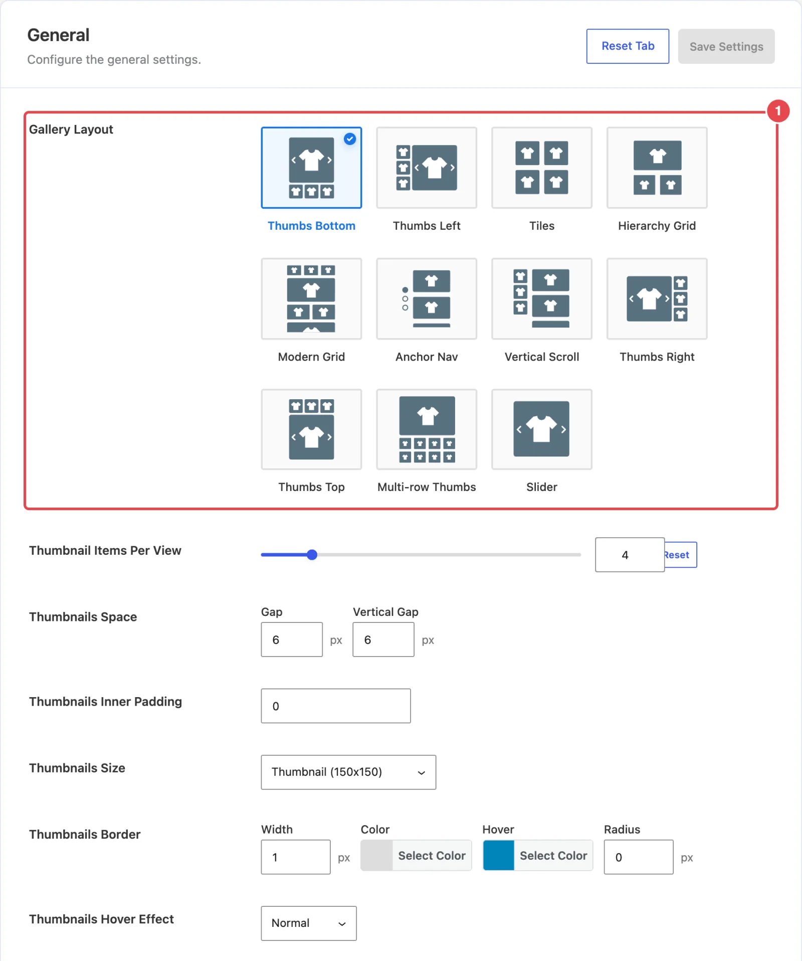
Gallery Layout
| Setting | What it does | Default |
|---|---|---|
| Gallery Layout | Chooses how the product's images are arranged: Thumbs Bottom, Thumbs Left, Tiles, Hierarchy Grid, Modern Grid, Anchor Nav, Vertical Scroll, Thumbs Right, Thumbs Top, Multi-row Thumbs or Slider. Each card in the picker shows a small diagram of the layout. | Thumbs Bottom |
| Modern Grid Style | Picks one of five mosaic patterns, Style 1 to Style 5. Each style mixes small and large tiles in a different order. Shown when the layout is Modern Grid. | Style 1 |
Not sure which layout fits your products? Layouts Overview compares all eleven, with examples.
Grid options
These fields shape the grid layouts, which show every image at once instead of one at a time.
| Setting | What it does | Default |
|---|---|---|
| Columns | How many columns the grid uses on each screen size. There are four boxes, marked with device icons: Desktop, Small Desktop, Tablet and Mobile. Desktop sizes take 1–12 columns; Mobile takes 1–6. Shown for Tiles and Hierarchy Grid. Modern Grid's pattern sets its own columns. | 2 / 2 / 2 / 1 |
| Visible Gallery Items | All shows every image. Specific shows only the first few and keeps the rest back. Shown for Tiles, Hierarchy Grid and Modern Grid. | All |
| Number of Items | How many images show before the rest are held back. Shown when Visible Gallery Items is Specific. | 4 |
| Gallery Expansion | How shoppers reach the held-back images. Show More Button adds a button below the grid that reveals the rest; you style it on the Show More Button sub-tab. Scroll fixes the grid's height to the visible items and lets shoppers scroll inside it. Shown when Visible Gallery Items is Specific. | Show More Button |
| Gallery Image Space | The gap between images, in pixels. Gap is the space between columns; Vertical Gap is the space between rows. Shown for Tiles, Hierarchy Grid, Modern Grid, Anchor Nav and Vertical Scroll. | 10 / 10 |
Long galleries on grid layouts
A product with twenty photos makes a very tall Tiles grid. Set Visible Gallery Items to Specific and show four or six. The page stays compact, and shoppers who want more are one click away.
Thumbnails
Thumbnails are the small preview images that let shoppers jump to a photo. These fields appear for the layouts that have thumbnails: Thumbs Bottom, Thumbs Top, Thumbs Left, Thumbs Right, Multi-row Thumbs and Vertical Scroll. The few exceptions are noted in the table.
| Setting | What it does | Default |
|---|---|---|
| Thumbnail Items Display Type | Auto fits as many thumbnails into the column as its height allows. Custom lets you set the number yourself. Shown for Thumbs Left and Thumbs Right. | Auto |
| Thumbnail Items Per View | How many thumbnails are visible at once, from 1 to 20. When there are more images than that, the strip scrolls. Shown for Thumbs Bottom, Thumbs Top and Multi-row Thumbs, and for Thumbs Left/Right when Display Type is Custom. | 4 |
| Vertical Thumbnails Width | How wide the thumbnail column is, as a percentage of the whole gallery (10–50%). The main image takes the rest. Shown for Thumbs Left, Thumbs Right and Vertical Scroll. | 20% |
| Thumbnails Space | The gap between thumbnails in pixels. Gap is the space between thumbnails; Vertical Gap is the space between rows. | 6 / 6 |
| Thumbnails Inner Padding | Space, in pixels, between a thumbnail's border and its image. Handy if you want a framed look. | 0 |
| Thumbnails Size | Which of your site's image sizes to load for thumbnails, such as Thumbnail, Medium or Large, or Original uploaded image. Smaller files load faster; choose a bigger size only if your thumbnails look soft. | Thumbnail |
| Thumbnails Border | The border around each thumbnail: Width (px), Color, Hover color and corner Radius (px). | 1px, #dddddd, hover #0085BA, radius 0 |
| Thumbnails Hover Effect | A small animation when the pointer moves over a thumbnail: Normal (none), Zoom In, Zoom Out, Slide Up or Slide Down. | Normal |
| Thumbnails Activate on | Click changes the main image when a shopper clicks a thumbnail. Mouseover changes it as soon as the pointer moves over one. | Click |
Hover doesn't exist on phones
Mouseover and the hover effects only work with a mouse. On a touch screen a tap does the job, so the gallery still works there. It just loses the hover animation.
Active thumbnail
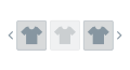
The active thumbnail is the one matching the image on screen. Marking it clearly tells shoppers where they are in the gallery.
| Setting | What it does | Default |
|---|---|---|
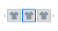
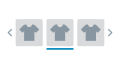
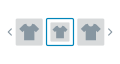
| Active Thumbnail Style | How the active thumbnail is marked: Border Around, Outer Line (a line along its edge), Zoom Out or Opacity (the active thumbnail fades). | Border Around |
| Active Thumbnail Border | Width (px) and Color of the border on the active thumbnail. Shown for every style except Outer Line. | 2px, #0085BA |
| Active Thumbnail Bottom Line | Width (px) and Color of the line. Shown when the style is Outer Line. | 2px, #237c92 |
| Active Thumbnail Box Shadow | A shadow around the active thumbnail: Horizontal, Vertical, Blur and Spread (px), plus Color. All zeros means no shadow. Shown when the style is Border Around. | 0 / 0 / 0 / 0, rgba(0,0,0,0.50) |
| Active Thumbnail Opacity Level | How faded the active thumbnail becomes, from 0 (invisible) to 1 (solid). Shown when the style is Opacity. | 0.3 |
Inactive thumbnails
You can also tone down the thumbnails that aren't selected, so the active one stands out more.
| Setting | What it does | Default |
|---|---|---|
| Inactive Thumbnails Effect | Normal leaves them as they are. Grayscale removes their color. Opacity fades them. Hidden when the Active Thumbnail Style is Opacity, because the two effects would cancel out. | Opacity |
| Grayscale Level | How much color to remove, from 0 (full color) to 1 (black and white). Shown when the effect is Grayscale. | 1 |
| Inactive Thumbnail Opacity Level | How faded inactive thumbnails are, from 0 (invisible) to 1 (solid). Shown when the effect is Opacity. | 0.7 |
Gallery image
These three fields apply to every layout.
| Setting | What it does | Default |
|---|---|---|
| Gallery Bottom Gap | Space, in pixels, between the bottom of the gallery and whatever comes next on the page. | 30 |
| Gallery Image Caption | Shows each image's caption on the gallery image. The text comes from the Caption field of the image in your Media Library, so an image without one shows nothing. | Off |
| Gallery Image Source | Which images the gallery starts with. Default & Variation Images shows all of the product's images, then narrows to a variation's own images when a shopper picks that variation. Variation Images starts on the first variation's images. | Default & Variation Images |
Captions & Alt Text covers where caption text comes from. Variation Images explains how the gallery reacts when a shopper picks a size or color.
In the free plugin
The free Smart Product Gallery for FluentCart offers two layouts here, Thumbs Bottom and Thumbs Top, so the grid options never appear.
These options show a Pro tag and are locked:
- Mouseover under Thumbnails Activate on
- Outer Line under Active Thumbnail Style
- Opacity under Inactive Thumbnails Effect
- Grayscale Level
- Gallery Image Caption
These aren't shown at all in the free plugin:
- the Zoom In and Slide Up hover effects
- the Zoom Out and Opacity active styles
- Active Thumbnail Bottom Line
- Inactive Thumbnail Opacity Level
- Gallery Image Source
Where to go next
- Gallery Slider: autoplay, effects and gallery height.
- Thumbnails Navigation: the arrows on the thumbnail strip.
- Layouts Overview: see each layout before you commit.