

Navigation & Pagination
Style the arrows and the dots on the main gallery image, the controls shoppers use to move between photos.
Where to find it: FluentCart → Product Gallery → Gallery → Navigation & Pagination (admin.php?page=smart-product-gallery#gallery/navigation_pagination)
Two kinds of control sit on the main image:
- Navigation: the previous and next arrows.
- Pagination: the row of dots (or numbers, or a progress bar) that shows how many images there are and which one is on screen.
Both are optional. You can show arrows, dots, both, or neither.
Not there? Check your layout
Like Gallery Slider, this sub-tab is hidden for Tiles, Hierarchy Grid, Modern Grid, Anchor Nav and Vertical Scroll. Those layouts show every image at once, so there's nothing to navigate.
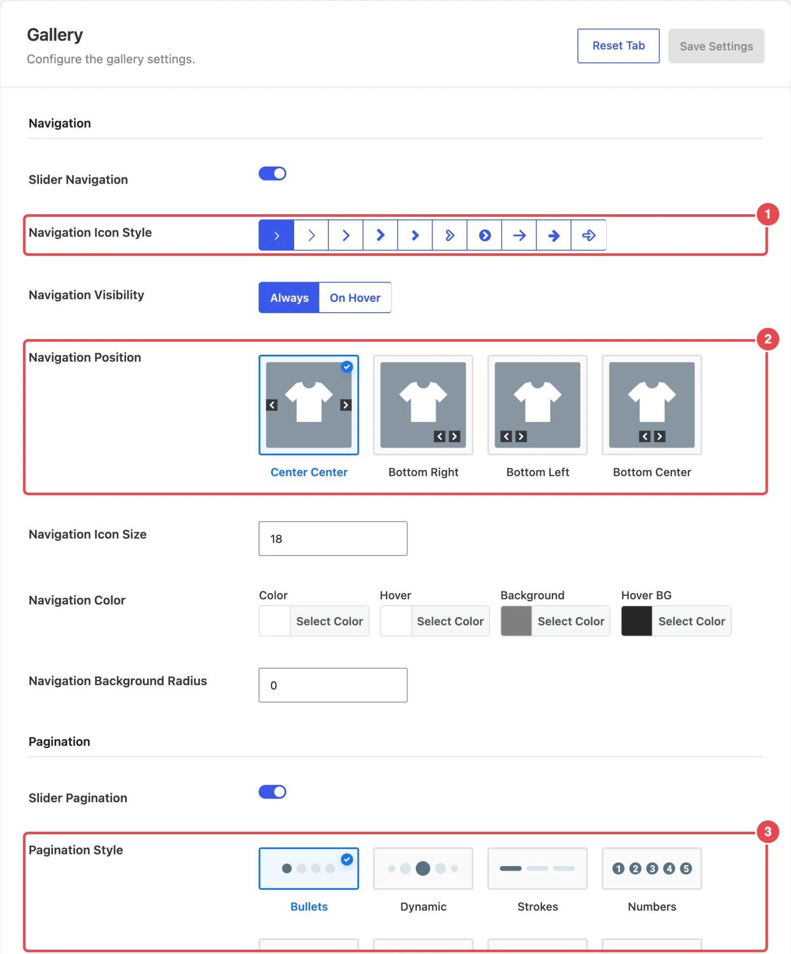
Navigation


| Setting | What it does | Default |
|---|---|---|
| Slider Navigation | Shows the previous and next arrows on the main image. Everything below depends on this being on. | On |
| Navigation Icon Style | Picks the arrow shape from ten designs: thin and bold chevrons, circled arrows, and straight arrows. | The first chevron |
| Navigation Visibility | Always keeps the arrows on screen. On Hover shows them only when the pointer is over the image. | Always |
| Navigation Position | Where the arrows sit: Center Center (one on each side, halfway down), Bottom Right, Bottom Left or Bottom Center. | Center Center |
| Navigation Icon Size | The arrow size in pixels. | 18 |
| Navigation Color | Four colors: Color (the arrow), Hover (the arrow under the pointer), Background (the box behind it) and Hover BG. | #fff, #fff, rgba(0, 0, 0, .5), rgba(0, 0, 0, .85) |
| Navigation Background Radius | Rounds the corners of the box behind each arrow, in pixels. A large value makes it a circle. | 0 |
Arrows on touch screens
On Hover looks tidy on a desktop. But phones and tablets have no hover, so shoppers there may never see the arrows. They can still swipe, but if your shoppers are mostly on mobile, Always is the safer choice.
Pagination


| Setting | What it does | Default |
|---|---|---|
| Slider Pagination | Shows a position indicator on the main image. Everything below depends on this being on. | On |
| Pagination Style | How the indicator looks: Bullets (a dot per image), Dynamic (dots that shrink towards the ends, good for long galleries), Strokes (short bars), Numbers, Progress Bar, Dot Hopper, Expanding Dot (the active dot stretches into a pill) or Flexing Fraction (a "2 / 7" style counter). | Bullets |
| Pagination Color | Color for the inactive dots, Active Color for the current one, and Background Color, the pill drawn behind the dots in the Expanding Dot style. | #CCCCCC, #7A8184, #fffFFF80 |
| Pagination Visibility | Always keeps the indicator visible. On Hover shows it only while the pointer is over the image. | On Hover |
| Pagination Margin | Moves the indicator away from its default spot: Top, Right, Bottom and Left, each 0–100px. Hidden for the Expanding Dot style. | 0 / 0 / 0 / 0 |
Why can't I see the dots?
Pagination is on by default, but it's set to On Hover. So on a fresh install, the dots only show while your pointer is over the image. Switch Pagination Visibility to Always if you want them visible all the time.
In the free plugin
In the free Smart Product Gallery for FluentCart, these options show a Pro tag and are locked:
- On Hover under Navigation Visibility and Pagination Visibility
- the Bottom Right, Bottom Left and Bottom Center arrow positions
- the Numbers, Progress Bar, Dot Hopper, Expanding Dot and Flexing Fraction pagination styles
Background Color isn't shown in Pagination Color. Because On Hover is locked, pagination in the free plugin is always visible.
Where to go next
- Thumbnails Navigation: arrows for the thumbnail strip, styled separately.
- Gallery Slider: autoplay and transition effects.
- Custom CSS Reference: fine-tune the arrows beyond these options.