

Thumbs Bottom & Top
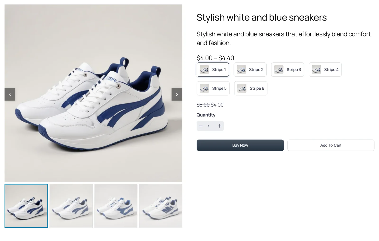
One large product image with a row of clickable thumbnails underneath (Thumbs Bottom) or above it (Thumbs Top). It's the layout shoppers already know, and it's the default.

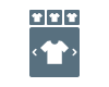
These two layouts are mirror images. The main image slides from one photo to the next, and the thumbnail strip below (or above) shows which photo is active. Clicking a thumbnail jumps straight to that photo. If there are more thumbnails than fit, the strip scrolls sideways with its own small arrows.
Both layouts are in the free plugin as well as Pro.
Thumbs Bottom
Thumbs Top
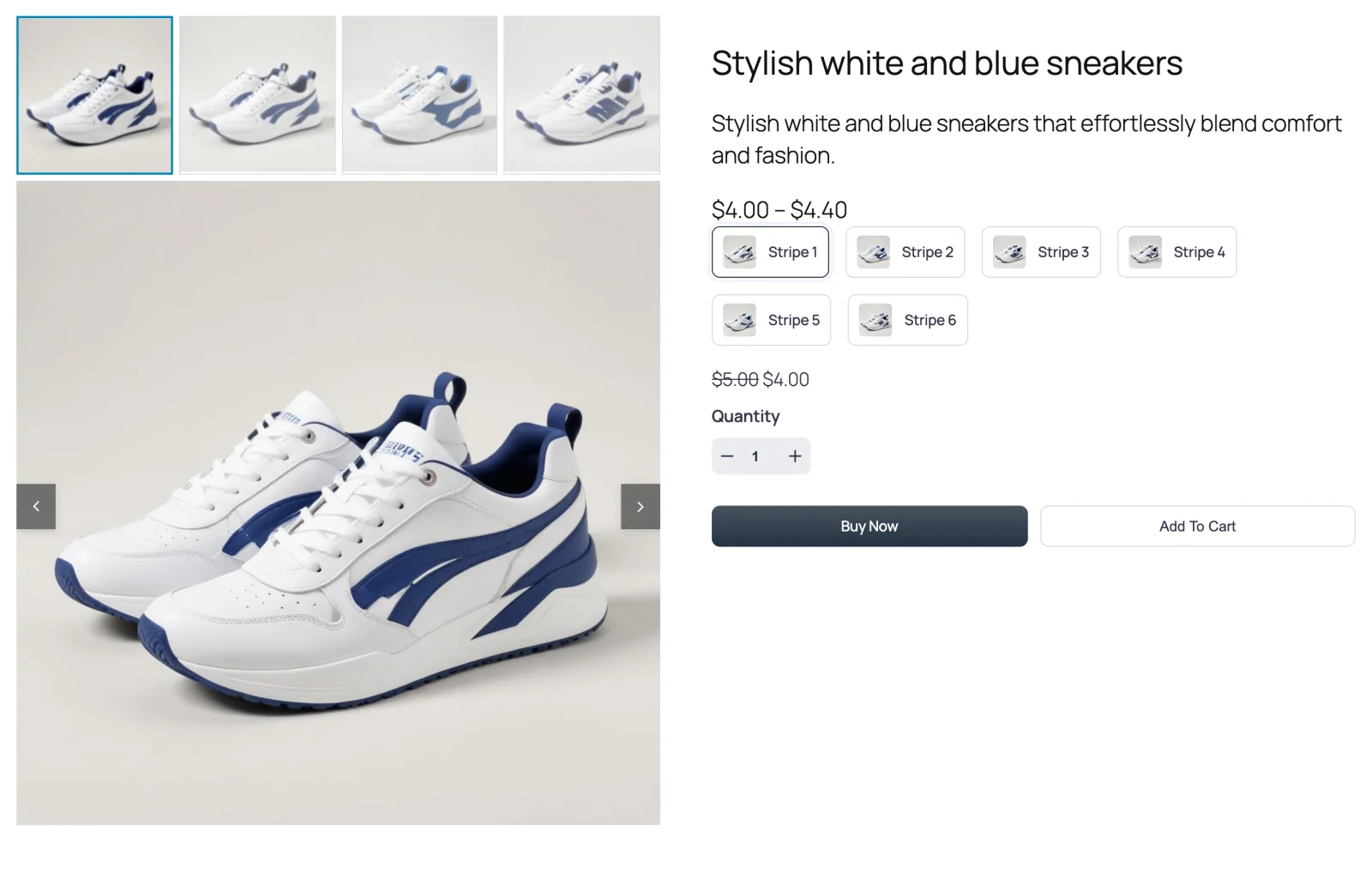
Thumbs Top puts the alternate views first. It works well when your first photo is a plain packshot and the more interesting angles are what you want shoppers to notice.
When to choose it
- You want the safe, familiar option. Shoppers recognize this pattern from almost every online store, so nobody has to work out how to use it.
- Your products have three to eight photos. That fills the strip nicely. With fewer, the strip looks half empty; with many more, look at Multi-row Thumbs.
- Your page is narrow or your theme puts the gallery in a column. A horizontal strip uses width rather than height, so it fits tight columns better than a vertical one.
How to switch to it
- Go to FluentCart → Product Gallery → General.
- Under Gallery Layout, click Thumbs Bottom or Thumbs Top.
- Click Save Settings.
Thumbs Bottom is the default, so a fresh install already uses it.
Settings that appear for this layout
On the General tab:
- Thumbnail Items Per View — how many thumbnails show in the strip at once (default 4). See Thumbnails.
- Thumbnails Space, Thumbnails Inner Padding, Thumbnails Size, Thumbnails Border, Thumbnails Hover Effect and Thumbnails Activate on — the look and behavior of the strip. See Thumbnails.
- Active Thumbnail Style and its related options — how the selected thumbnail stands out. See Active thumbnail.
- Inactive Thumbnails Effect — dim or grey out the thumbnails that aren't selected. See Inactive thumbnails.
- Gallery Bottom Gap, Gallery Image Caption and Gallery Image Source, which apply to every layout. See Gallery image.
Every sub-tab of the Gallery tab is available: Gallery Slider, Navigation & Pagination, Thumbnails Navigation (the small arrows on the strip) and Product Image.
Sub-tabs hidden for this layout
- Show More Button — it belongs to the grid layouts only.
Things worth knowing
- Thumbnail Items Per View is a maximum, not a promise. If a product has fewer photos than the number you set, the strip simply shows the photos it has. The strip's arrows and looping switch off when everything already fits.
- Hover-only extras don't exist on touch screens. If you set navigation to appear On Hover, phone shoppers won't see it until they tap the gallery. Swiping still works.
- The strip and the main image share the width. Very wide thumbnails (a large Thumbnails Size with few items per view) make the strip tall — keep an eye on how much space it takes below the main image.