

Modern Grid
A magazine-style mosaic that mixes small and large photos in a set pattern. Pick one of five patterns and every product's gallery follows it.

Modern Grid shows all your photos at once, like Tiles, but the photos aren't all the same size. Each style is a row pattern — for example three small, one large, two medium — that gives the gallery rhythm. It's the most editorial of the layouts.
The free plugin doesn't include this layout; it ships Thumbs Bottom and Thumbs Top.
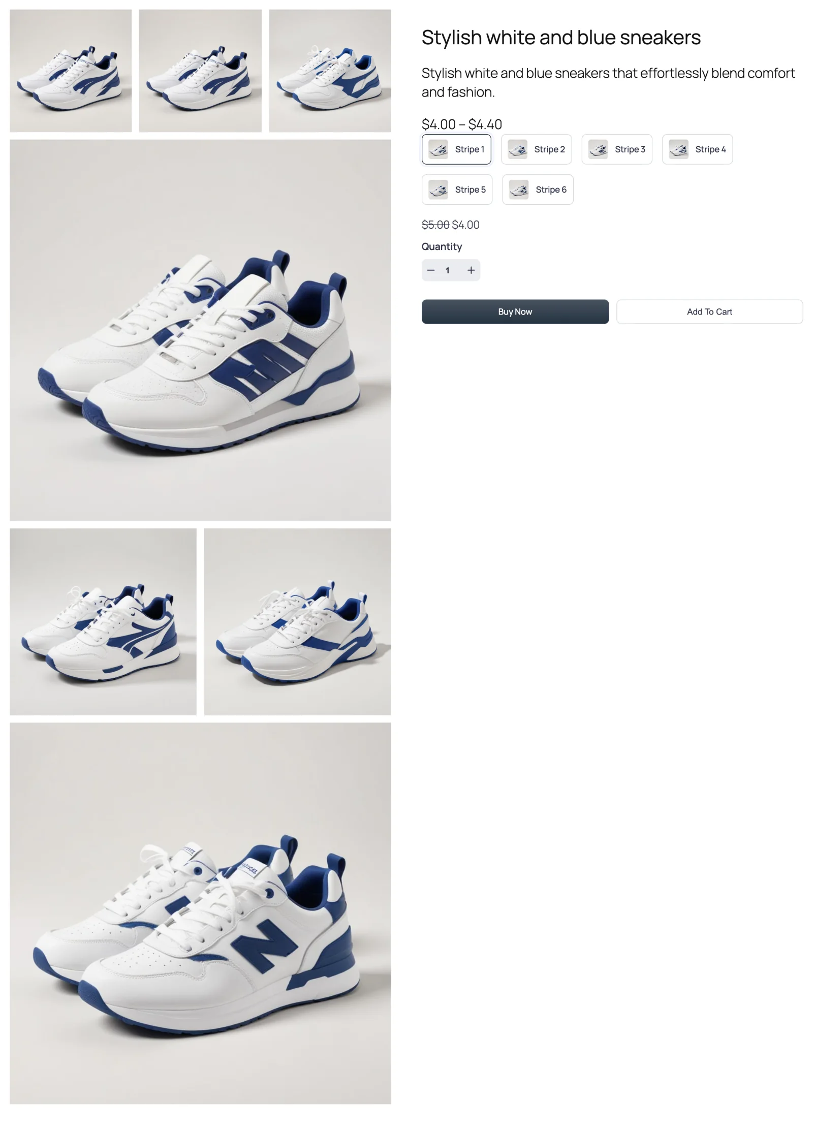
The five styles
Choose a style under Modern Grid Style, which appears on the General tab as soon as you select Modern Grid. The numbers describe how many photos sit in each of the first three rows.
| Style | Pattern | Rows |
|---|---|---|
 Style 1 (default) Style 1 (default) | 3 · 1 · 2 | Three small, one full width, two side by side |
 Style 2 Style 2 | 2 · 1 · 3 | Two side by side, one full width, three small |
 Style 3 Style 3 | 1 · 2 · 2 | One full width, then two rows of two |
 Style 4 Style 4 | 1 · 3 · 3 | One full width, then two rows of three |
 Style 5 Style 5 | 1 · 2 · 3 | One full width, two side by side, three small |
Styles 3, 4 and 5 open with a single full-width image, so they suit products with one strong hero shot. Styles 1 and 2 open with smaller photos and put the big image in the middle — good when no single photo deserves to lead.
When to choose it
- You want the gallery to feel designed, not just arranged. Lookbooks, fashion, home décor.
- Your products have around five to seven photos. That's roughly what each pattern is built for (see below).
- You want everything visible without the uniform look of Tiles.
How to switch to it
- Go to FluentCart → Product Gallery → General.
- Under Gallery Layout, click Modern Grid.
- Under Modern Grid Style, pick a style.
- Click Save Settings.
Settings that appear for this layout
On the General tab:
- Modern Grid Style — the five patterns above. See Gallery layout.
- Visible Gallery Items, Number of Items and Gallery Expansion — show only the first few photos and reveal the rest with a button or an inner scroll. See Grid options.
- Gallery Image Space — gaps between images. See Grid options.
- Gallery Bottom Gap, Gallery Image Caption and Gallery Image Source. See Gallery image.
There's no Columns setting — the style decides the columns.
On the Gallery tab: Product Image, plus Show More Button when Visible Gallery Items is Specific.
Sub-tabs hidden for this layout
- Gallery Slider, Navigation & Pagination and Thumbnails Navigation.
Things worth knowing
- The pattern covers the first six or seven photos. Any photos after that are shown one per row, full width. If your products have many more photos than the pattern, consider Visible Gallery Items → Specific so the extras stay behind a Show More button.
- The mosaic flattens on smaller screens. Below about 770px wide every style becomes a plain two-column grid, and below about 480px a single column. The pattern is a desktop treatment.
- Mixed photo shapes can look uneven. Tiles in the same row are given the same width; photos with very different aspect ratios will leave the row ragged. Square or consistently shaped photos work best.