

Thumbs Left & Right
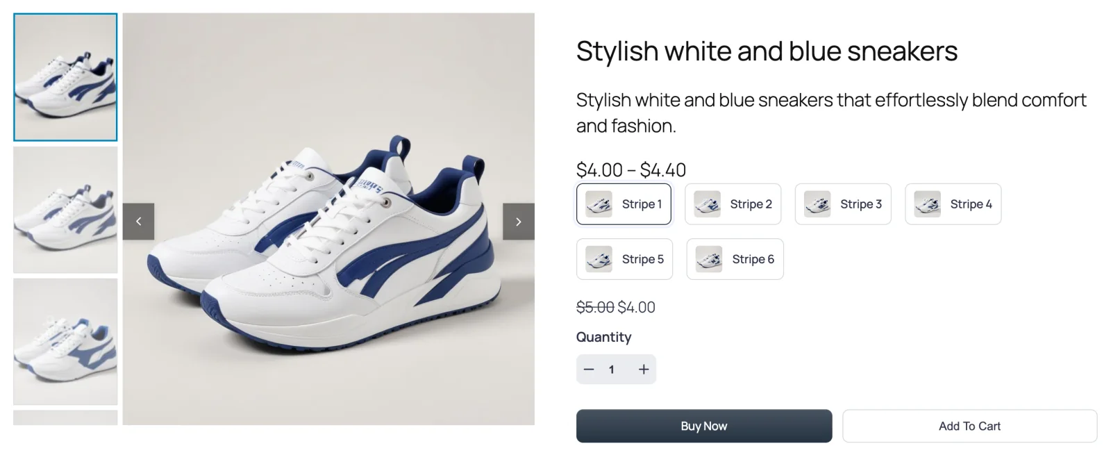
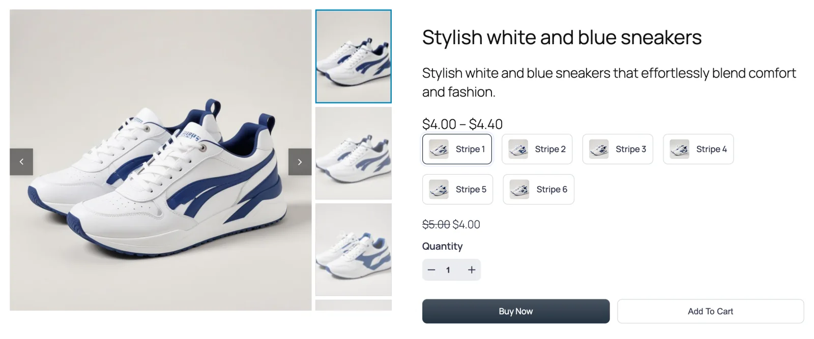
A vertical column of thumbnails beside the main image — on the left (Thumbs Left) or the right (Thumbs Right). It keeps the alternate views in view without pushing anything further down the page.
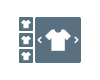
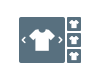
These two layouts are mirror images. The thumbnails stack in a narrow column next to the main image, and clicking one slides the main image to that photo. When there are more thumbnails than fit beside the image, the column scrolls up and down.
The free plugin doesn't include these layouts; it ships Thumbs Bottom and Thumbs Top.
Thumbs Left
Thumbs Right
When to choose it
- Your product page has room to spare sideways. A side column uses width instead of height, so the product details and the Buy button stay higher on the page.
- Your photos are tall. Portrait shots — clothing on a model, bottles, standing lamps — leave space at the sides of a wide frame. A thumbnail column fills it.
- You want a premium, catalogue-like look. A vertical rail of thumbnails reads as more editorial than a strip underneath.
Thumbs Right is handy when your theme puts the product details on the left, or simply when you want the thumbnails to sit between the image and the Buy button.
How to switch to it
- Go to FluentCart → Product Gallery → General.
- Under Gallery Layout, click Thumbs Left or Thumbs Right.
- Click Save Settings.
Settings that appear for this layout
On the General tab:
- Thumbnail Items Display Type — Auto lets the column fill the height of the main image; Custom lets you set an exact number with Thumbnail Items Per View. See Thumbnails.
- Vertical Thumbnails Width — how wide the column is, as a percentage of the gallery (default 20%). See Thumbnails.
- Thumbnails Space, Thumbnails Inner Padding, Thumbnails Size, Thumbnails Border, Thumbnails Hover Effect and Thumbnails Activate on. See Thumbnails.
- Active Thumbnail Style and Inactive Thumbnails Effect. See Active thumbnail and Inactive thumbnails.
- Gallery Bottom Gap, Gallery Image Caption and Gallery Image Source. See Gallery image.
Every Gallery sub-tab except Show More Button is available: Gallery Slider, Navigation & Pagination, Thumbnails Navigation and Product Image.
Sub-tabs hidden for this layout
- Show More Button — grid layouts only.
Things worth knowing
- The column takes width from the main image. At 20% the main image gets the other 80%. If your thumbnails look cramped, raise Vertical Thumbnails Width a little rather than shrinking the thumbnails.
- Auto vs Custom. With Auto, the number of visible thumbnails follows the height of the main image, so it can vary between products with differently shaped photos. Choose Custom if you want every product to show the same number.
- Hover doesn't exist on touch screens. If the thumbnail arrows are set to appear On Hover (the Pro default), phone shoppers see them only after tapping. Dragging the column still works.