

Thumbnails Navigation
When a product has more images than its thumbnail strip can show, small arrows let shoppers scroll the strip. This sub-tab styles those arrows.
Where to find it: FluentCart → Product Gallery → Gallery → Thumbnails Navigation (admin.php?page=smart-product-gallery#gallery/thumbnails_navigation)
These arrows only move the thumbnail strip, not the main image. The arrows on the main image are set on Navigation & Pagination.
The arrows only matter when there are more thumbnails than fit. With the default four thumbnails per view and a product with three photos, nothing needs scrolling, so the strip shows no arrows. Shoppers can also swipe or drag the strip.
Not there? Check your layout
This sub-tab only appears for layouts with a thumbnail strip: Thumbs Bottom, Thumbs Top, Thumbs Left, Thumbs Right and Multi-row Thumbs. It's hidden for Slider (no thumbnails) and for Tiles, Hierarchy Grid, Modern Grid, Anchor Nav and Vertical Scroll.
Thumbnails Navigation
| Setting | What it does | Default |
|---|---|---|
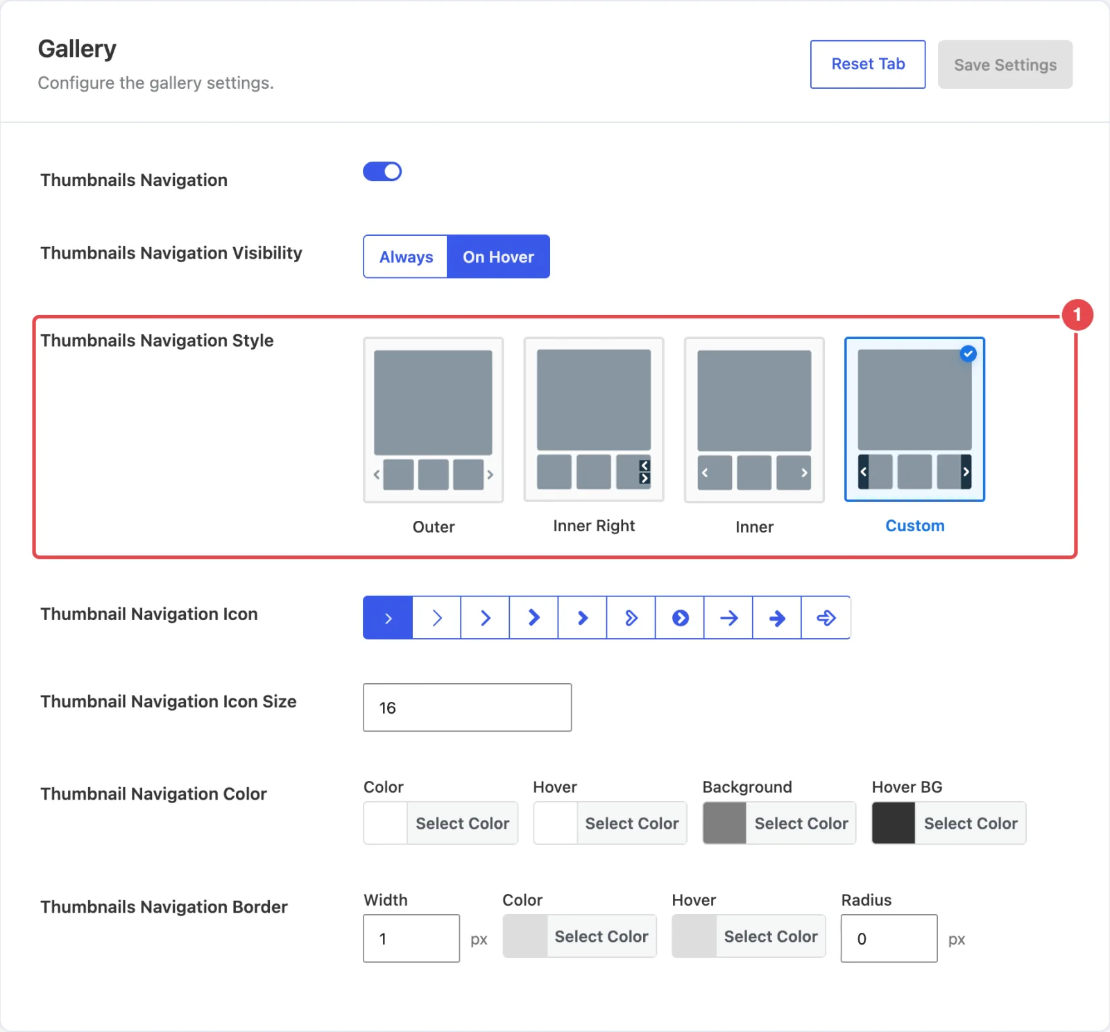
| Thumbnails Navigation | Shows arrows on the thumbnail strip. Everything below depends on this being on. | On |
| Thumbnails Navigation Visibility | Always keeps the arrows on screen. On Hover shows them only while the pointer is over the strip. On a touch screen there's no hover, so shoppers there swipe the strip instead. | On Hover |
| Thumbnails Navigation Style | Where and how the arrows are drawn. See the four styles below. | Custom |
| Thumbnail Navigation Icon | Picks the arrow shape from ten designs. | The first chevron |
| Thumbnail Navigation Icon Size | The arrow size in pixels. | 16 |
| Thumbnail Navigation Color | Color, Hover, Background and Hover BG for the arrows. Shown for the Inner Right and Custom styles. | #fff, #fff, rgba(0, 0, 0, 0.5), rgba(0, 0, 0, 0.8) |
| Thumbnail Navigation Color (Outer) | The same four colors for the lighter styles. The background is transparent by default, so only the arrow shows. Shown for the Outer and Inner styles. | #8796A1, #8796A1, transparent, transparent |
| Thumbnails Navigation Border | A border around each arrow: Width (px), Color, Hover color and corner Radius (px). | 0px, #dddddd, #dddddd, radius 0 |
| Thumbnails Navigation Box Size (Icon) | The Width and Height (px) of the box each arrow sits in. Hidden for the Custom style, which sizes its own bars. | 30 × 30 |
The four styles


| Style | What it looks like | Best for |
|---|---|---|
| Outer | Plain arrows just outside each end of the strip. | A clean look that keeps every thumbnail fully visible. |
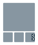
| Inner Right | Two small arrows stacked at the right-hand end. | Keeping both controls together, out of the way. |
| Inner | Light arrows drawn over the first and last thumbnails. | Saving width in narrow columns. |
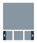
| Custom | Solid bars down both ends of the strip, each with an arrow. | The most obvious controls, and the plugin's default. |
In the free plugin
In the free Smart Product Gallery for FluentCart, two options show a Pro tag and are locked:
- On Hover under Thumbnails Navigation Visibility
- the Inner and Custom styles
Free users get Outer and Inner Right, with the arrows always visible.
Where to go next
- General → Thumbnails: how many thumbnails show at once, their size, border and hover effect.
- Navigation & Pagination: the arrows and dots on the main image.
- Thumbs Bottom & Top: the layouts these arrows are made for.