

Anchor Nav
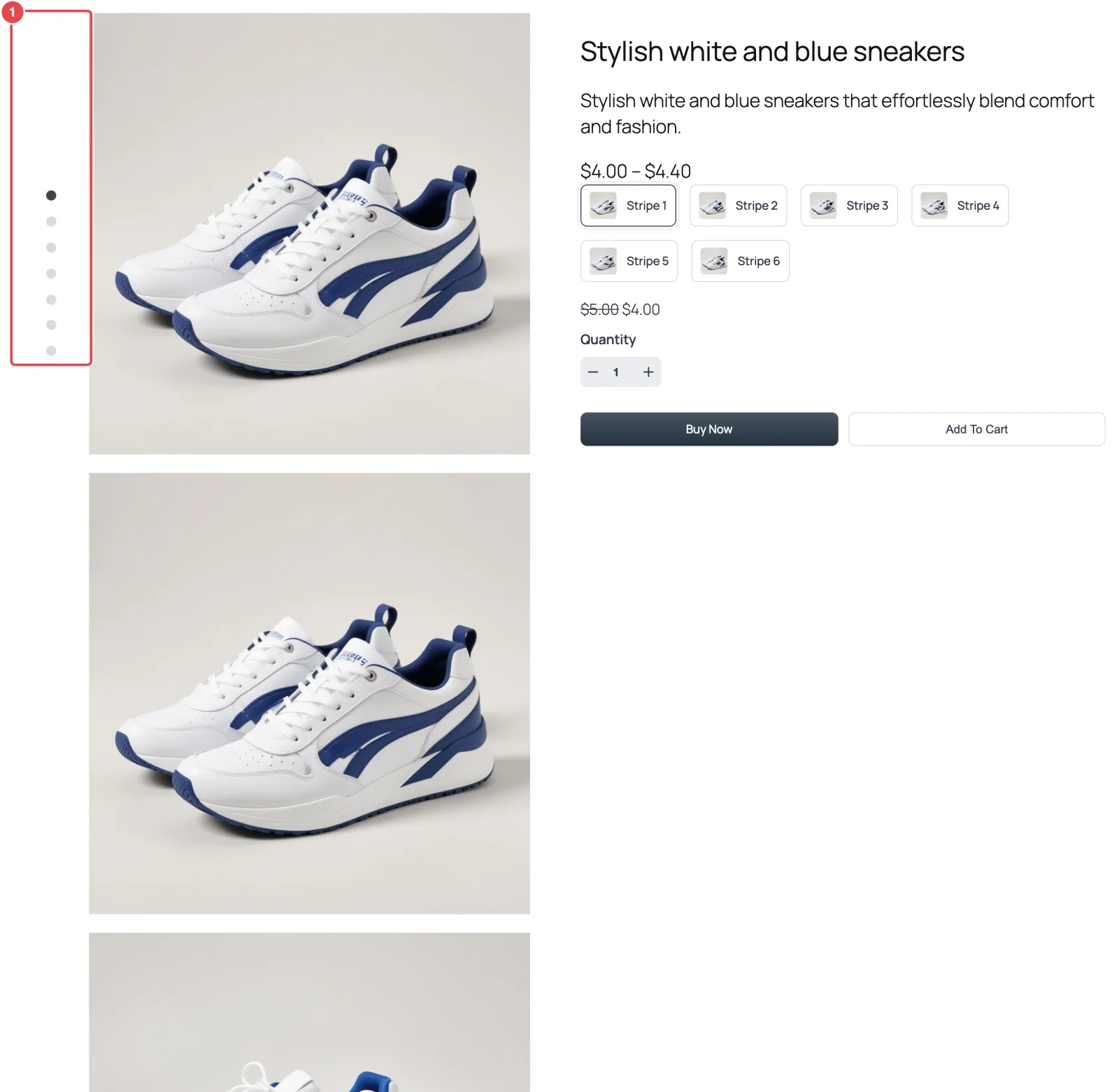
Your photos stacked in one tall column, with a row of small dots beside them. Each dot jumps to its photo, and the dots follow along as the shopper scrolls.

Anchor Nav turns the gallery into a scrolling column of large images. A narrow strip of dots — one per photo — sits to the left and stays in place as the page scrolls. Clicking a dot scrolls the page straight to that photo. It reads like a long-form product story rather than a slideshow.
The free plugin doesn't include this layout; it ships Thumbs Bottom and Thumbs Top.
When to choose it
- Your photos are big and beautiful. Each one gets the full width of the gallery column.
- Your product pages are long anyway. Detailed descriptions, size charts, reviews — a scrolling gallery fits that rhythm.
- You want the product details always in view. On wide screens the summary stays beside the images as shoppers scroll.
If you like the idea but want thumbnails instead of dots, look at Vertical Scroll.
How to switch to it
- Go to FluentCart → Product Gallery → General.
- Under Gallery Layout, click Anchor Nav.
- Click Save Settings.
Settings that appear for this layout
On the General tab:
- Gallery Image Space — the gap between stacked images. See Grid options.
- Gallery Bottom Gap, Gallery Image Caption and Gallery Image Source. See Gallery image.
On the Gallery tab, only Product Image applies.
Sub-tabs hidden for this layout
- Gallery Slider, Navigation & Pagination and Thumbnails Navigation — nothing slides.
- Show More Button — Anchor Nav always shows every photo.
Things worth knowing
- Every photo is always shown. There's no Visible Gallery Items setting for this layout, so a product with twelve photos is a long column. That's the point of the layout, but check your longest product.
- The dots aren't styled from the settings panel. Their color comes from the plugin's stylesheet; to change it, use Additional CSS.
- It's a desktop treatment. On phones the images still stack, and the summary scrolls with the page instead of sticking.