

Fashion Store Gallery
Build a clothing-store gallery: thumbnails down the side, a zoom window that shows fabric close up, and a full-screen lightbox, all in about ten minutes.
What you're building
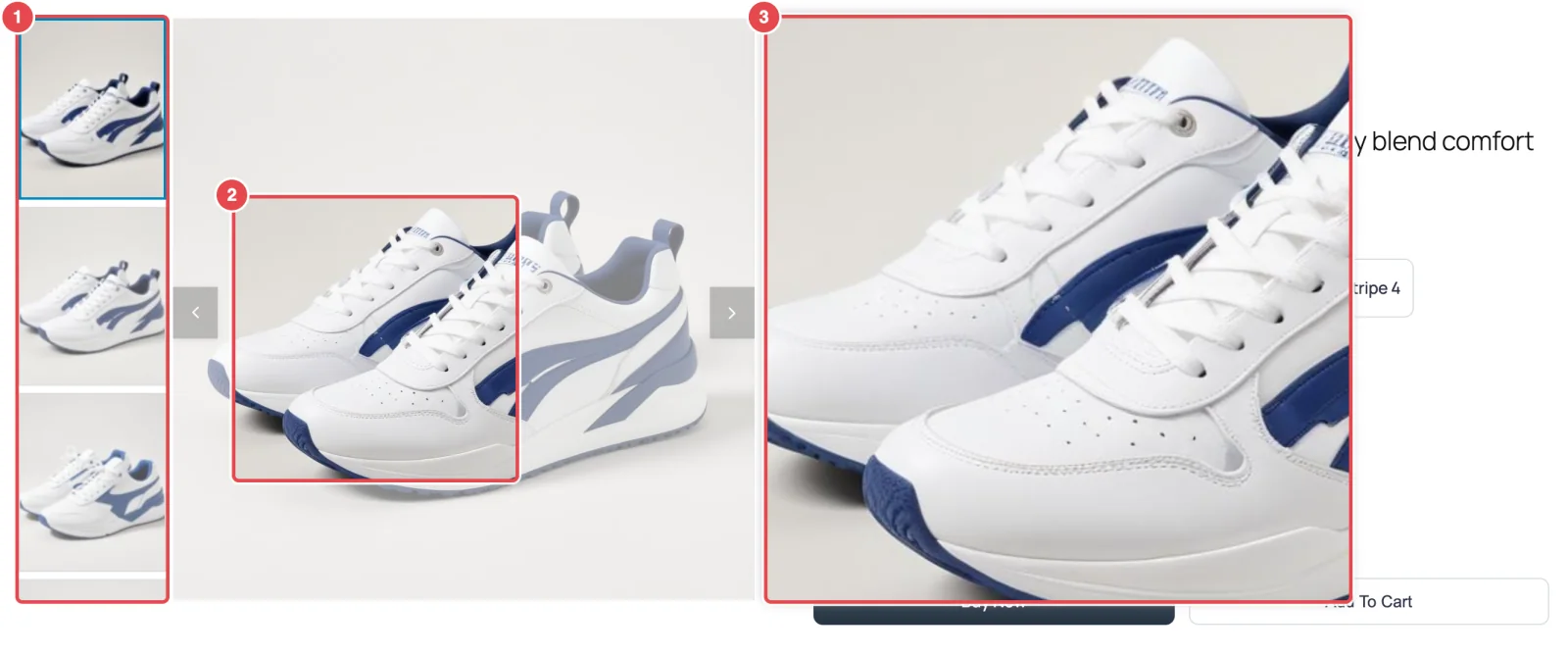
Clothes and shoes sell on detail. Shoppers want to see the weave, the stitching and how the color really looks. This setup gives them three ways to look closer, and keeps the price and Buy Now button in view the whole time:
- Thumbs Left. A column of thumbnails beside the main image. The thumbnails take up width instead of height, so the gallery stays short and the product details stay visible.
- Outside zoom. Hovering the photo opens a magnified view in a window beside it, the way large fashion retailers do it.
- Lightbox. Clicking opens the photos full screen, with a thumbnail strip, for shoppers on phones who can't hover.
Before you start
- A product with five or more photos, all the same shape (all square, or all portrait). Mixed shapes make the main image jump in height as shoppers click through.
- Photos that are larger than the gallery shows them, at least 1200px on the long side. Zoom can only magnify detail that's in the original file. A 600px photo has nothing extra to show. Why →
Step 1: Choose Thumbs Left
- Go to FluentCart → Product Gallery → General.
- Under Gallery Layout, click Thumbs Left.
- Leave Thumbnail Items Display Type on Auto. The thumbnail column then fits as many thumbnails as the main image's height allows. Choose Custom only if you want an exact number per view.
- Vertical Thumbnails Width sets how much of the gallery the thumbnail column takes up. The default is 20%. For most product shots 18–22% looks balanced. Go narrower and the thumbnails become hard to tap on a phone.
- Under Active Thumbnail Style, keep Border Around. A clear outline on the current thumbnail tells shoppers which photo they're on.
- Click Save Settings.
Refresh your product page. The thumbnails now run down the left. Thumbs Left & Right →
Step 2: Stop the slideshow
Out of the box the gallery slides on its own every three seconds. That's nice on a banner, but a shopper studying a jacket doesn't want the photo changing under their cursor.
- Open Gallery → Gallery Slider.
- Turn AutoPlay off.
- Keep Infinite Loop on, so the arrow on the last photo takes shoppers back to the first.
- Click Save Settings.
Step 3: Add the Outside zoom
- Open the Zoom tab. Enable Image Zoom is on by default.
- Under Zoom Style, choose Outside. A new group of settings appears beneath it.
- Zoom Scale controls the magnification. The default of 2 is a good start for clothing. Raise it to 3 for jewellery or watches, where the detail is tiny.
- Leave Zoom Window Size Type on Auto. The window then matches the main image's size, which looks tidy beside the product details.
- Zoom Window Distance is the gap between the photo and the window. 10px is fine. Increase it if the window crowds the photo.
- Product Image Overlay on Hover tints the main photo while zoom is active, so the eye goes to the window. Custom Color with the default white at 0.5 opacity is subtle. Blur is more dramatic.
- Click Save Settings.
Hover over the main image on your product page. A lens follows your cursor, and the zoomed view appears beside the photo.
Zoom on phones
There's no hover on a touchscreen, so the Outside window doesn't appear on phones and tablets. That's what the lightbox in the next step is for. It gives touch users a full-screen view they can pinch and swipe.
Step 4: Set up the lightbox
- Open the Lightbox tab. Enable Lightbox is on by default.
- Turn on Thumbnails Gallery Visibility. A thumbnail strip then appears inside the lightbox, so shoppers can jump straight to the back view or the label close-up.
- Leave Full Screen Button and Transform Controls on. Transform Controls adds buttons to zoom in and out, view the photo at actual size, rotate it and flip it.
- Leave Download Button off. Most stores don't want their product photography downloaded with one click.
- Click Save Settings.
Click the main image. The lightbox opens with your photos and a thumbnail strip. Lightbox settings →
Step 5: Check it on a phone
Open the product on your phone, or use your browser's device preview. On narrow screens the layout keeps working: tap a thumbnail to switch photos, and tap the main photo to open the lightbox. If the thumbnail column feels cramped, go back to General and nudge Vertical Thumbnails Width up a few percent.
Variations on this recipe
- Thumbnails on the right. Choose Thumbs Right in step 1. Everything else stays the same.
- No zoom window. If your theme's product details are narrow, the Outside window can cover them awkwardly. Choose Inside (2x) in step 3 instead, which zooms within the photo itself.
- Hover to switch. Under General → Thumbnails Activate on, choose Mouseover. Desktop shoppers can then scan through photos just by moving down the thumbnail column.
Where to go next
- Image Zoom — all four zoom styles compared
- Grid with Show More — the opposite approach, with every photo at once
- Best Practices — photo sizes and shapes that suit galleries