

Vertical Scroll
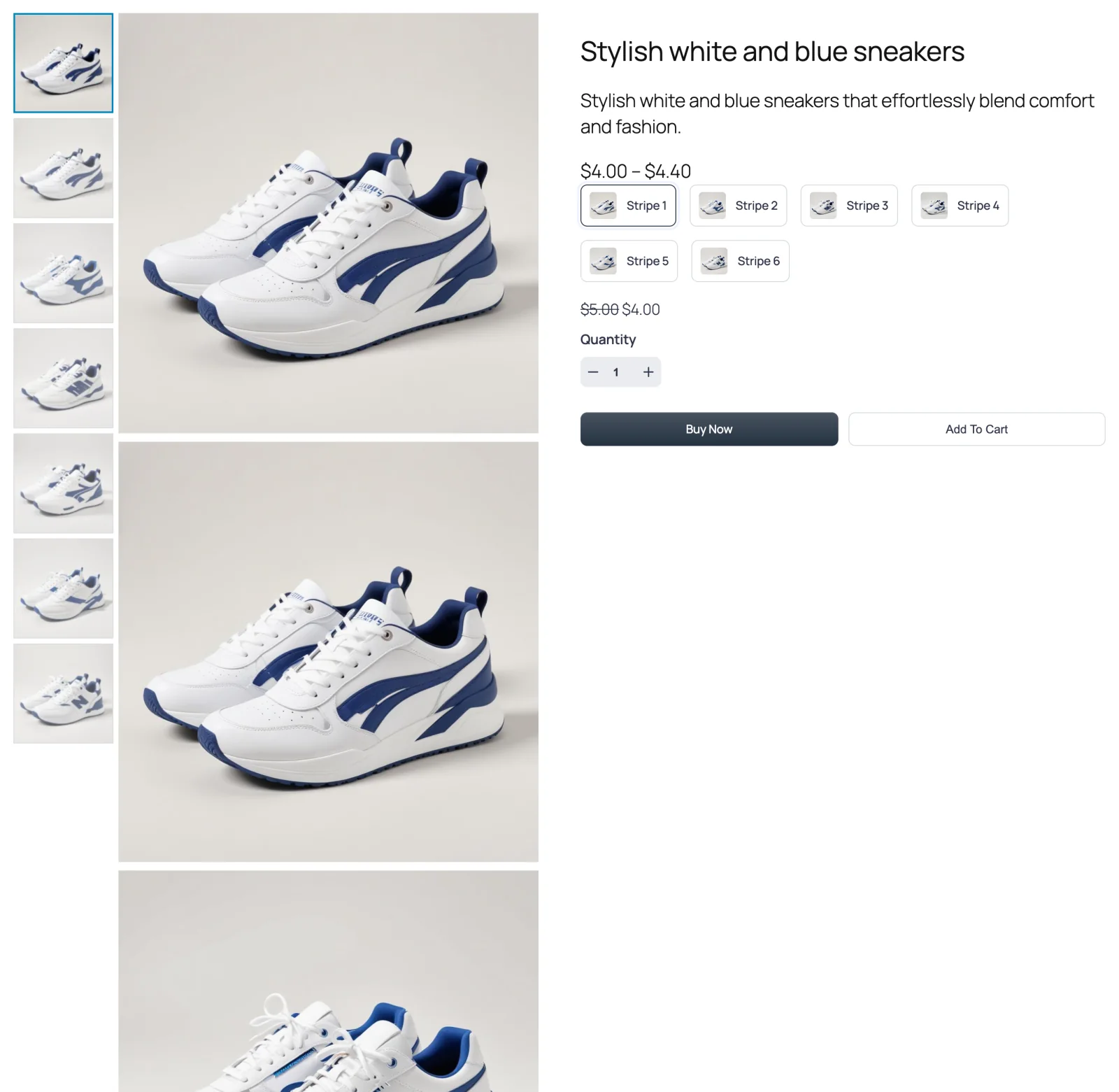
Large photos stacked in a column, with a rail of thumbnails beside them that stays in place as the page scrolls. Click a thumbnail and the page glides to that photo.

Vertical Scroll is the layout many fashion stores use. The photos run down the page one after another, full width of the gallery column. On the left, a narrow rail of thumbnails stays put while the shopper scrolls, and the thumbnail for the photo currently on screen is highlighted. Clicking a thumbnail scrolls straight to its photo.
The free plugin doesn't include this layout; it ships Thumbs Bottom and Thumbs Top.
When to choose it
- You sell apparel, shoes or anything shot on a model. Tall, full-width photos and a quick-jump rail feel natural for these.
- You want both overview and detail. The rail shows how many photos there are; the column shows them big.
- Your product summary is short. On wide screens the summary sticks beside the column, so the Buy button stays in view the whole way down.
Prefer dots to thumbnails? Anchor Nav is the same idea with a lighter navigation strip.
How to switch to it
- Go to FluentCart → Product Gallery → General.
- Under Gallery Layout, click Vertical Scroll.
- Click Save Settings.
Settings that appear for this layout
On the General tab:
- Gallery Image Space — the gap between stacked photos. See Grid options.
- Vertical Thumbnails Width — how wide the thumbnail rail is, as a percentage of the gallery (default 20%). See Thumbnails.
- Thumbnails Space, Thumbnails Inner Padding, Thumbnails Size and Thumbnails Border — the look of the rail. See Thumbnails.
- Thumbnails Hover Effect and Thumbnails Activate on — set it to Mouseover and simply hovering a thumbnail jumps to its photo. See Thumbnails.
- Active Thumbnail Style and Inactive Thumbnails Effect — how the thumbnail for the photo on screen stands out. See Active thumbnail and Inactive thumbnails.
- Gallery Bottom Gap, Gallery Image Caption and Gallery Image Source. See Gallery image.
There's no Thumbnail Items Per View here — the rail lists every photo.
On the Gallery tab, only Product Image applies.
Sub-tabs hidden for this layout
- Gallery Slider, Navigation & Pagination and Thumbnails Navigation — nothing slides; the rail is the navigation.
- Show More Button — every photo is always shown.
Things worth knowing
- Every photo is always shown, so the gallery is as tall as all your photos stacked. Products with a dozen photos make a long page — which is usually what this layout is for, but check your largest product.
- Mouseover can surprise people. With Thumbnails Activate on → Mouseover, moving the pointer across the rail scrolls the page. Click is the calmer default.
- On phones it's a simple stack. Sticky elements need a wide screen; on a narrow one the photos and summary scroll normally.